
The recent rebranding of the Seattle Sounders has received praise from numerous soccer enthusiasts who were intrigued by the new crest. The team has revamped its identity to engage the football community, coinciding with the celebration of the North American club’s fiftieth anniversary. This innovative approach, tailored to the preferences of the fans, goes beyond just a change in color scheme. The emblem, featuring the Space Needle towering over the cityscape, embodies the essence of Washington State, symbolizing modernity as it reaches towards the sky. Similarly, both Orlando City and Cincinnati have developed their own distinctive symbols, refining their designs to convey a clearer message. The flowing lines in their emblems evoke a dynamic and vibrant blend of colors. Inspired by a financially-driven perspective with roots in Yankee sensibilities, identity shaping has been exemplified by Fiorentina’s ownership, adorned with stars. A few years ago, La Viola unveiled the results of an ambitious restyling initiative spearheaded by Rocco Commisso’s intuitive vision, aiming to breathe new life into the Cecchi Gori creation. While the iconic lily within the picturesque V remained unchanged, the rhombus, a distinctive feature of the designer’s personality, was replaced by a diamond, accented with gilded curves. The initiative faced public disapproval, with dissenting voices gathering in Piazza della Signoria, brandishing protest banners amidst a sea of violet flags.
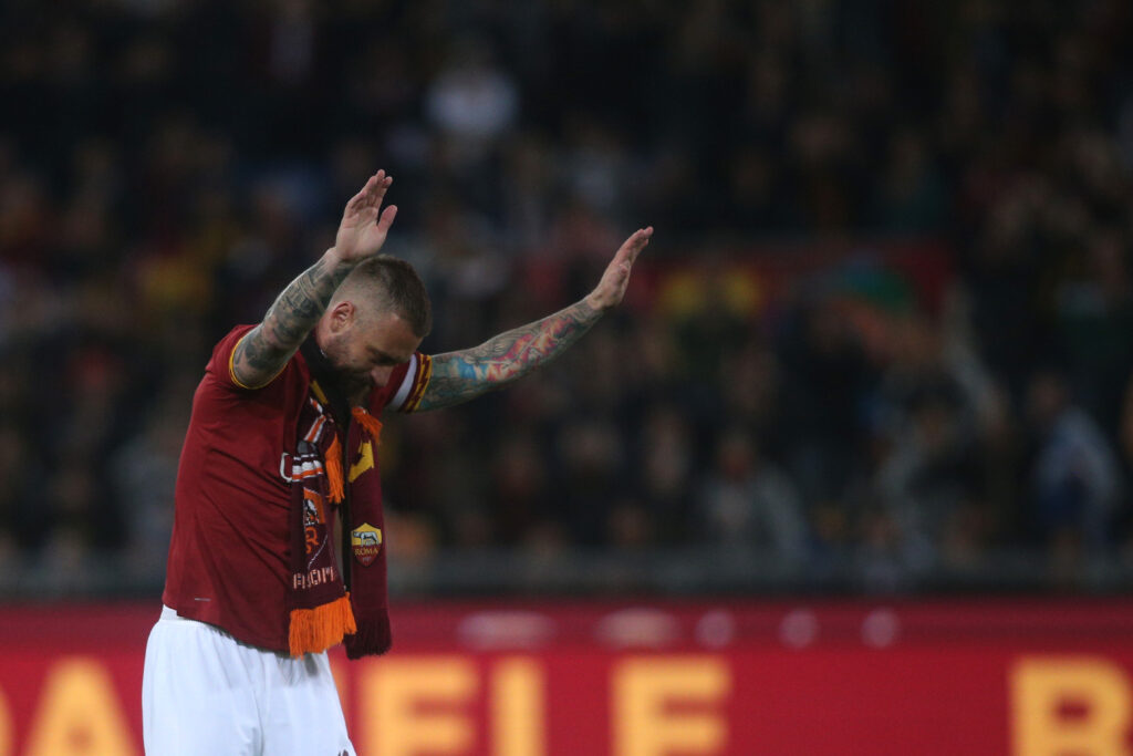
Despite James Pallotta’s adoption of a ‘less is more’ minimalist approach at AS Roma, which involved removing the ‘ASR’ script to honor a birth anniversary, Giallorossi fans have passionately urged the Friedkin consortium since 2013 to reinstate the original script. Additionally, La Spezia also falls under American ownership. After their relegation to Serie B, the club announced a crest redesign with the tagline: “Anchored in the past, sailing into the future.” The designer altered the classic appearance of the Ligurian club, sparking controversy and raising several concerns, including the absence of the acronym ‘ASC’ and an aesthetic that some found reminiscent of an extreme right-wing association.
Montreal Impact pursued a renewal, changing both the badge and the name. They later reintroduced the Québec fleur-de-lis, echoing LOSC Lille’s decision to retain both the flower and the dogue despite their renovation. In 2019, Nantes made changes by removing the green schooner and five arrows, opting for a more generic N. The rationale behind this move? “A great squad always welcomes great challenges”, although its applicability in this case is debatable. The concept agency Leroy Tremblot applied a similar approach to Stade Reims, characterized by an outdated and minimalist vision. An old-fashioned crest can be revitalized through reinterpretation, preserving the club’s historicity while maintaining its distinctive character.
In honour of Hellas Verona’s 120th anniversary, the Scaligeri proposed a refreshed vintage logo, imbuing a retro flavor to pay homage to the Gialloblù tradition of the Piccola Roma. Meanwhile, AS Roma opted to reintroduce Piero Gratton’s Lupetto former crest. Similarly, Genoa, much like Norwich City, marked their promotion with a bold restyling, modifying the Grifone‘s appearance while preserving its essence. The Blossom agency, in collaboration with co-founder Giacomo Frigerio, creative director Simone Pessina, and content writer Arianna Losi, led the project. Despite the new emblem bearing resemblance to the previous version, the updated gold griffon manages to make a distinct impression.
Following the centenary celebration, Leeds United unveiled a temporary badge symbolizing the renowned ‘salute’, which sparked significant backlash and prompted the initiative to be swiftly halted. English clubs like Bristol City, Brentford, Aston Villa, and notably Manchester City, have transitioned to a more conventional circular format for their crests. The City Football Group’s new crest, influenced by Qatari ownership, has been adopted not only by Manchester City but also by sister clubs New York City FC, Melbourne City FC, and Montevideo City Torque. The Red Bull takeover similarly resulted in a notable case of franchise management, with the emblem being redesigned to promote the brand. When Thierry Henry joined the team, the New York-based side underwent a name change to incorporate the Austrian corporate identity, echoing the Bragantino strategy (Red Bull later took over Brazil’s Clube Atlético Bragantino in 2020 and soon began playing as Red Bull Bragantino).
As reported by BBC Sport, Austria Salzburg recently faced their rivals in the Austrian cup, a team that the club had acquired years ago to endorse a significant energy drink brand. The transformation occurred on June 13, 2005, following weeks of protests and resistance, leading to Austria Salzburg adopting the name Red Bull Salzburg, with their traditional purple colors replaced by red and white.
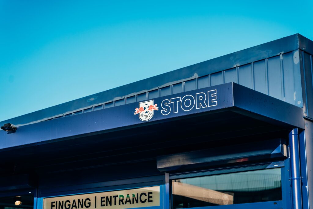
Following the draw announcement, the board, in an act of defiance, opted not to use the other team’s name in any promotional advertisements, choosing instead to refer to them solely by their initials. They also replaced their crest with a white logo, over which the script ‘RBS’ was overlaid, dismissing the opposing team as nothing more than a “construct”. In Germany, in accordance with the 50+1 rule of the German Football Association, sports law prohibits a company from being the sole owner of a team, thus prohibiting the use of a brand’s name to identify a national club. Consequently, Leipzig had to identify themselves as RasenBallsport – which translates to GrassBallSport – while ensuring that the initials ‘RB’ were retained.
Rebranding efforts can also be aimed at strategically repositioning a corporate entity in the market, as evidenced by the emergence of new emblems following the bankruptcy of teams such as Bari, later restructured, as well as Catania and Palermo. In 2012, Cardiff City made a significant alteration to their home jersey kit, transitioning from the traditional white and blue pairing to red and black. The redesign included enlarging the prominent Welsh dragon, overshadowing the classic bluebird. This ambitious but ultimately unsuccessful initiative, driven by chairman Vincent Tan’s investment, aimed to enhance the club’s appeal in the international market. However, the change was promptly reversed, and the former bluebird emblem was reinstated.
Venezia FC underwent a rebranding process that involved replacing the gilded lion of St. Mark. The task was entrusted to the Bureau Borsche studio, under the guidance of Greek creative director Ted Philipakos. The resulting design featured a V incorporating the prows of gondolas, a distinctive feature of the Venetian lagoon. Concurrently, the designer revitalized the refined crest of Athens Kalithea, and Modena updated their visual identity by adopting the players’ epithet ‘yellow canary’.
Meanwhile in Milan, the Deutsche design group has reimagined Beneamata Giorgio Muggiani’s concept, rejuvenating it through Alessandro Furchino Càpria’s photographic campaign, thus advancing the visionary mission of Inter Milan. This mission asserts: “The team aimed to modernize the icon using contemporary language, forging a new visual identity. I believe the project extends beyond mere communication methods, resembling that of an international sports brand.”
In 2017, Juventus unveiled a new identity, eliminating other references and focusing on the Bianconeri colors, the Campionato badge, and the letter J. A club press release announced: “The club officially changes its identity, propelling itself into the future with a fresh visual image that signifies a completely revamped brand and style.” The dismantling of the heraldic shield marks a significant shift, introducing a monogram that personalizes brand merchandise, aligning with streetwear fashion trends, as seen in collaborations with magazines like Germany’s 032C. Football brand designer Christopher Payne, in an interview with GQ, admitted, “our aim is to distill the club’s personality into a design that is simple yet infused with character, substance, and style”.
The national teams have undergone similar transformations to rejuvenate themselves and adopt a new look, as evidenced by countries like the USA, Netherlands, and Italy. Despite protests from the Azzurri, FIGC President Gabriele Gravina has discussed the latest iteration of the brand, stating, “through the new Scudetto and a revitalized sonic identity, Italians step into a new dimension, aiming to convey exhilarating emotions. Emotions have played a role in innovating a glorious tradition, inspiring the brand-new Azzurri badge.” The Serie A Made in Italy initiative aims to showcase local fashion, cuisine, and films, with the goal of securing around €400 million in television rights from foreign broadcasters. The Italian government seeks to uphold high-quality standards, as exemplified by the diamond Scudetto logo.
Despite being an iconic symbol of the Premier League and retaining its esteemed status, the crowned lion underwent a significant makeover, undergoing deep modification. Similarly, in La Liga, there is an agreement with EA SPORTS for €30 million per year, resulting in a badge redesign. In 2017, Atlético de Madrid introduced a new crest that abandoned sharp corners and the emblematic golden lines that previously encircled the logo, instead adorning it with the statue of the bear and the strawberry tree.
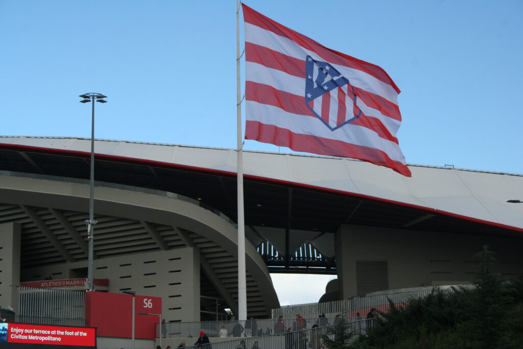
On one hand, a significant seventy thousand Roji Blanco members have voted in favor of reinstating the former Colchoneros badge, which is set to be applied from the upcoming season. The corporatization of football raises concerns about jeopardizing the culture of passionate cheering, potentially compromising the soul of the game as communities navigate the balance between progress and nostalgia for idealized memories. Soccer clubs are compelled to align with the 120px app, a digital formula tailored for websites, social networks, and sport uniforms, ensuring that the crest maintains a functional and versatile appearance.
In line with the current trend, crests have become more convenient for immediate recognition. In the past, favoring the minimalism embraced by many companies, the most effective badge was often one that a child could easily replicate by drawing. Color combinations are adept at establishing a connection with the birthplace, cities, and towns whose spiritual link fans are deeply connected to. Traditionalists resist innovation, regardless of the effort or outcome, while others argue that modernism has a disruptive impact on our lives, irrespective of differing opinions. From the perspective of many sports enthusiasts, newcomers should align themselves with the principles that clubs promote through various information channels, emphasizing the need for diligence and transparency. Membership holds significant value in rallying the masses, a collective of individuals passionate about the sport, transcending the mere spectacle of twenty-two men chasing a ball. For instance, when Inter Milan changed their crest, there was no sense of betrayal felt, as many believe no one should overlook the broader vision that binds them to be part of the Nerazzurri congregation – “Milan is home to just two teams: Inter Milan and their academy,” remarked Peppino Prisco, the lawyer and club vice-president.
The intensity of the rivalry hinges on self-esteem and a reverence for iconoclasm, concealed beneath refined manners. It goes beyond the stadium’s creed, akin to a church, where fans profess their faith in superstition and celebrate their unique identity.